OVERVIEW
Signal, the second unique feature I designed for Playhouse, creates an ‘Aha Moment’ by fostering real-time, proximity-based connections among college students. By enabling users to send and respond to social requests, it bridges online networking with in-person interactions. Post-MVP, our focus shifted to enhancing daily engagement and retention.
ROLE
Product Design Lead - Product Strategy, User Testing, Interaction Design, Prototyping
TEAM
CEO, 1 PM, 1 UX Designer Intern,5 Software Engineers, 3 Marketers
TIMELINE & STATUS
July 2024 - October 2024
Shipped
WHY SIGNAL?
Bridging the Gap Between Weekends and Daily Social Life
After launching Meetup (event), we noticed a gap—college parties thrive on weekends, but weekday engagement remained low. With 40% drops in DAU and 2x fewer logins on weekdays, students lacked an easy way to meet new people nearby outside of big events. To boost daily engagement and retention, we designed Signal—a lightweight, real-time social request feature that helps students effortlessly connect with others nearby, even on busy school days.

Background
Signal is Playhouse’s answer to spontaneous socializing.
It helps college students send quick, airdrop-style social requests on their school map—whether for a study session, a party, or a last-minute coffee run. No planning, no hassle—just instant, real-life connections.
Problem
...But users are’t engaging as expected.
While our DM-to-Meet conversion rate is impressively high at 90%, the problem starts before that - not enough users are sending or responding to signals in the first place.
😢
Most users don’t take the initiative to send signal.
😨
Only 12% respond after viewing one.
"How might we encourage users to take the first step—creating, responding to, and sustaining engagement over time?
Solution Highlights

Making Signal Creation More intuitive with Progressive Disclosure
Instead of heavy tutorials, we used progressive disclosure—guiding users step by step from broad categories to specific requests for quick, intuitive learning.
Adding Flexible Background Selection for Easier Signal Creation
During creation process, if users don’t have a photo idea or prefer not to take one, they can quickly choose from a pre-set of visually appealing backgrounds, making the process faster and more engaging.
Instant Emoji Reactions for Effortless Engagement
When browsing, users can engage with signals effortlessly by sending a quick emoji reaction instead of starting a chat. A simple tap lets them show interest and interact instantly!
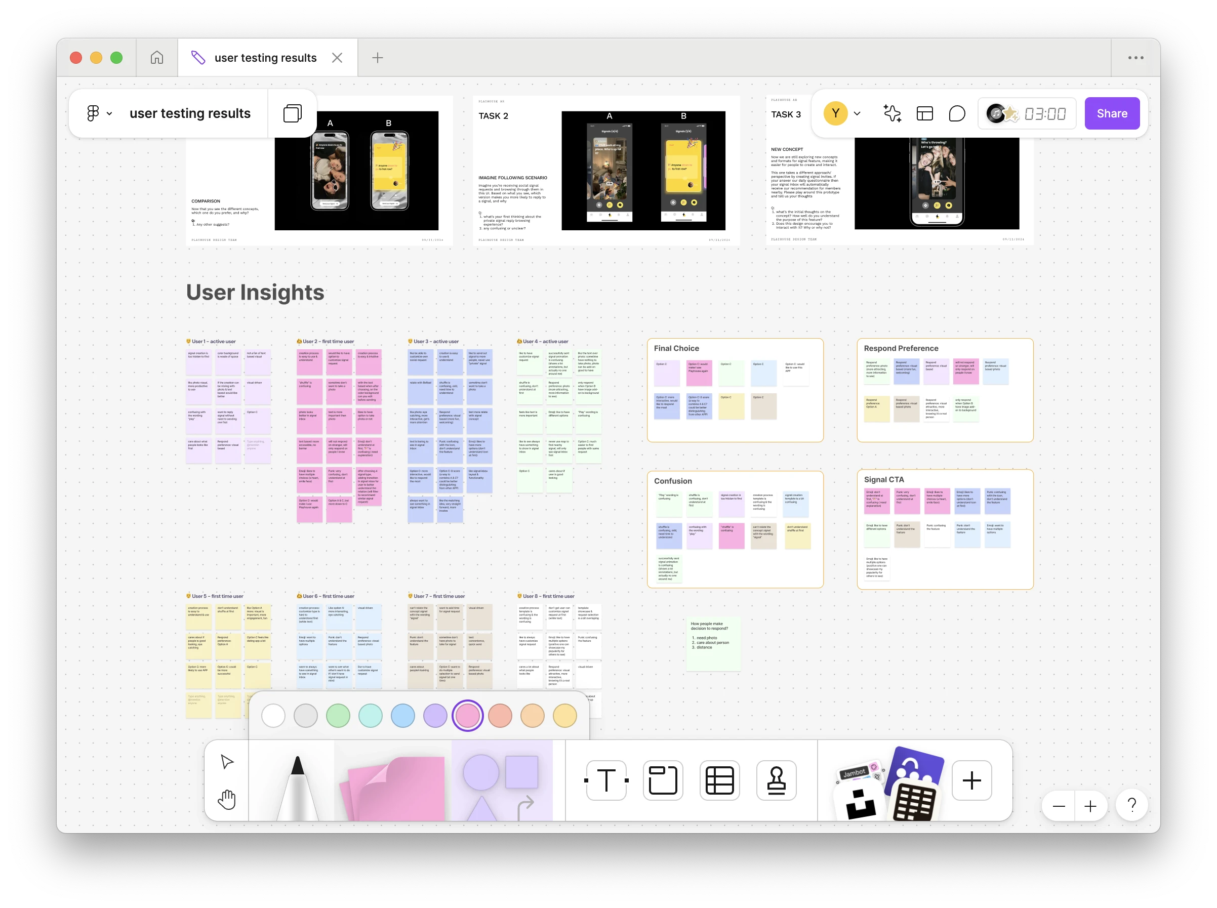
User Research
Understand user pain points
By conducting interview sessions of 8 users, I map out 2 user journeys for both signal creator and viewers to analyze user pain points and needs for each different stage.
What our Creators say?

What our Viewers say?

Creators vs. viewers
Creators find taking a photo is unnecessary, but viewers rely on them for interest and credibility.

The key challenge..."How might we make the signal creation easier while keeping engaging viewers to reply?”
Ideation
Exploring the optimal content format: finding the right balance
Strategy A: Text-oriented
A utility-first approach—text-based signals with pre-set colored backgrounds for clarity and ease. This explores whether text alone can drive engagement, though it may lack visual appeal.
Strategy B: Selfie-Oriented
Since users engage most based on who’s sending the request, this approach uses profile photos as signal backgrounds to increase recognition and response rates. While it removes a step, selfies may not always fit certain social requests.
Strategy C: Flexible Media
Flexibility meets engagement—users can take a photo or pick a background, keeping signals customizable yet visually compelling.
A:Text-oriented
B: Selfie-oriented
C: Hybrid Approach

User testing
The Flexible Approach wins - Photo/video signals drive the most engagement, but nearly 50% of creators see potential in text with more engaging backgrounds.
I prototype this out and conduct A/B testing with 16 users. The goal is to validate which design makes the signal creation process easier to understand and use and identify which version encourages users more to respond more frequently to signals
Visual Design
Designing themed preset backgrounds for optional text-oriented signals
We've set up the background with different signal categories , including play, date, fitness, study, relax, and help, to make it easy for users to resonate quickly.


Iteration
Reducing friction, boosting Signal creation
I noticed the MVP made users struggle—forcing random photos or overthinking, causing drop-offs. After discussion with leadership roles, to maximize engagement, we still prioritized media over text while introducing a hybrid approach. This solution reduced drop-outs by 30%.
Before
Requiring a photo made spontaneous signals awkward—users either took random, irrelevant pictures or hesitated, slowing down signal sending experience.
⬇️ 30% Drop out Rate
After
I introduced a hybrid approach—media remains the priority, but users can now auto-fill a category-based background or swap to a profile photo, making signal creation effortless and customizable.
Improving clarity - full disclosure vs. progressive disclosure
Our core feature should be accessible, guiding users into action. I restructured the experience using progressive disclosure, allowing users to start easily while discovering deeper functionalities. Additionally following the Home as a Hub strategy, we prioritizes the core feature on the landing page, encouraging daily user habit formation.
Before
Pre-recorded tutorials were misleading, and the rolling effect overwhelmed users with too much information at once—making the feature harder to grasp. The original UI was also visually noisy, with a silver camera frame that lacked accessibility and made text difficult to read.
⬇️ 50% Task Time
After
Using progressive disclosure, we simplified the flow—starting with broad categories for easy decisions, then letting users refine their requests or skip if unsure. I also redesigned the background to a dark theme, creating a more immersive experience where categories stand out clearly, improving both usability and accessibility.
Enhance Signal’s Discoverability
Since this is a new feature, I needed to improve its visibility. I redesigned the app structure, moving the Signal inbox from the hidden notification center to a dedicated tab on the nav bar, making it more accessible and driving more interactions.

Before
❌ Too hidden entry point buried inside notification
❌ 2 steps to check private/friends signal
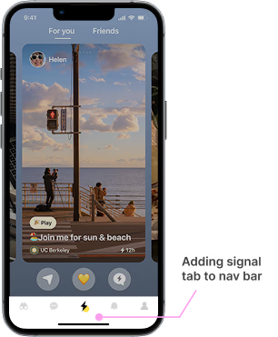
After
✅ Streamlined app structure for quick signal response
✅ Signal tab is easily accessible in nav bar
✅ Increased engagement
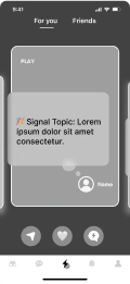
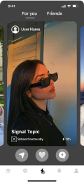
Encourage user engagement
Engagement felt like a big step, so I made it effortless. Now, users can quickly react with emojis or explore where a signal was sent and who sent it. This not only boosts engagement but also strengthens the connection to our core map-based discovery experience.
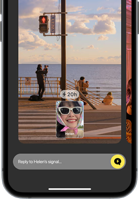
Before
❌ Only 1 way to interact: chat, making responses feel like a big commitment
After
✅ More ways to interact:quick reaction without overthinking
✅ Discover our social map to see where signals are sent and sender profile.
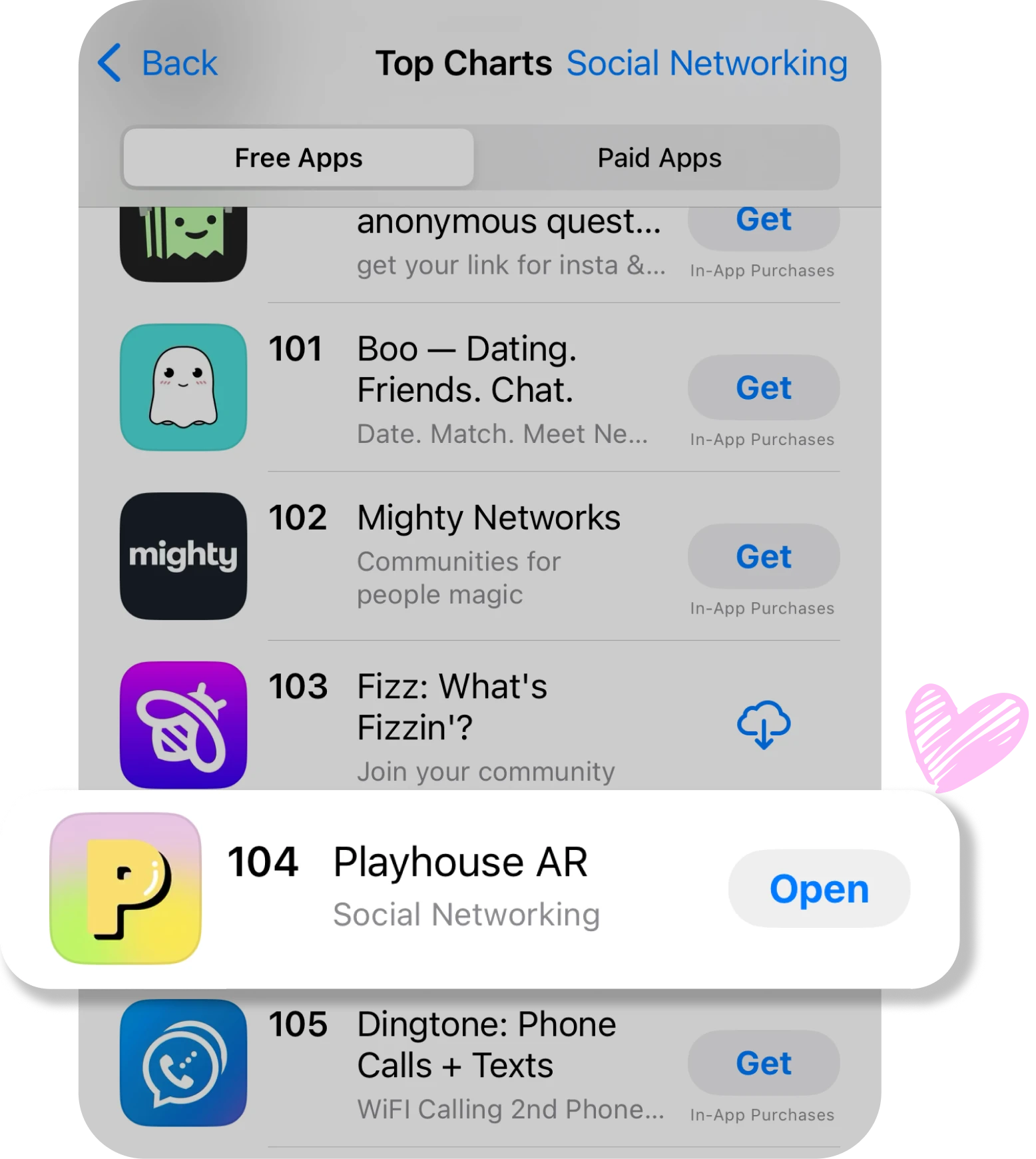
Impact
Bridging Gaps, Driving Growth
It’s exciting to see how product strategy and design can shape user behavior. We bridged the gap between weekdays and weekends, making the app a go-to even on campus weekdays—pushing 30-day retention to 40%. And with this new version, the momentum kept going—our app climbed the ranks, breaking into the Top 100 on the App Store, which is a big milestone in growth.
+26%
DAUs
+12%
Signal Creation Rate
+18%️
30-day User Retention
+25%
Reply-to-Send Ratio